Diligence
- Apr 8, 2025
- Nostalgia, Skeuomorphism, Work
- Outcome High fidelity UI comps
- Client Zach Fisher and myself
- Skills Visual Design, UI Design
- Tools Photoshop
- Period Summer 2011, Spring 2013
- Collaborators Zach Fisher
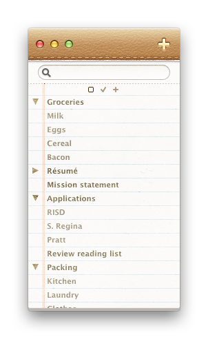
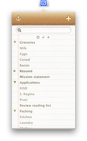
In mid 2011,[1] GTD apps were a booming space for indie developers. Between Things, The Hit List, Wunderlist and infinite others, we saw a small opportunity for a low-real-estate to-do list with projects, sections, and individual tasks.[2]
Hover over a highlighted part of the interface to learn more.
Zach and I began by appraising our ideal GTD solution. We wanted novelty, but without monopolizing the user’s focus. At a time when desktop and mobile UIs were increasingly visually rich and illustrative, we took plenty of liberty in visual design. But, its core was a simple task list. It didn’t need to occupy the user’s screen and demand larger-scale management. It didn’t need to scale from simple list items to complex multidimensional and interdependent tasks.
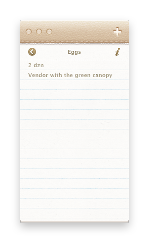
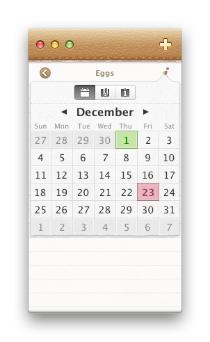
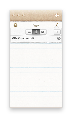
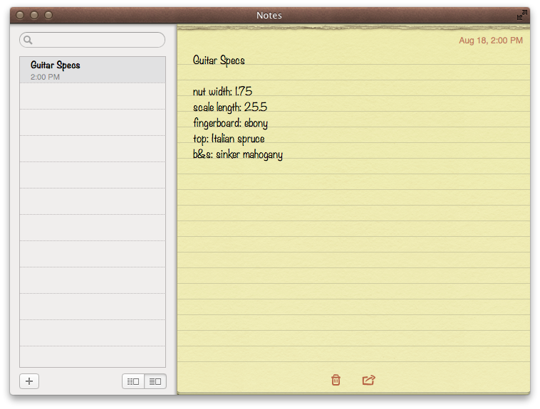
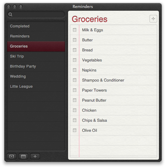
It needed a main view with tasks, groups of tasks, and mutually-exclusive groups of groups. Furthermore, we planned a detail view allowing for a task description, start and end dates, attached files, and further information.
I designed an app icon and interface icons for the Preferences window.
From left to right: general, categories, and appearance.
As a self-taught newcomer to product design and development, I often worked backwards from the product that I wished existed, designing what I desired others build. Like a lot of ideas then — it was fun, and left incomplete.